
Don't do massive amounts of UI/UX work but heard really good things about this book so I bought it! Anyone flicked through it already? WDYT?

#uiux
1 post1 participant0 posts today


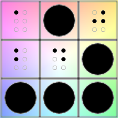
 This is going to be the main menu in my puzzle game, and there is nothing you can do about it!
Hey, I've got a great idea! How about light switches that disappear until you move your hand over them? Otherwise they're just invisible!
Great idea, right?
Then why did you do it to the SCROLL BARS?!
Replied in thread

@wilhelm @CoMaps I feel like this is just a case of having written software long enough to know the hypotheticals.
"Oh why do users keep hitting back there and losing their settings? Obviously we should save by default."
or
"Everyone seems to be using this same feature 3 levels deep in the settings, lets move it up to the front page."
There are LOTS of random things #telemetry helps you improve in software if you're the type who cares about UI/UX.
#uiux #softwareDevelopment

Apple Design creating all sorts of rules so that our apps adhere to their standards of fit and finish (even throwing your icons in squircle jail in Tahoe) makes me feel like they have gone full-blown HOA.
Mac OS X Tiger was more like those cute/quaint towns with character and Tahoe is the result of gentrification and knocking all that down for McMansions/Cookie-cutter homes with HOAs.
Your app has to go through everything they want and fit their mold.
macOS Tahoe:

It's no small thing, CSS can now do carousels natively, with no javascript.
"scroll buttons, scroll markers, scroll driven animation, scroll-state() queries, :has(), grid, anchor and so much more.
Even more impressive is the accessibility story.
Carousel best practices are handled by the browser, thanks to the engineering and accessibility teams working together. It'd be very difficult to make a more accessible carousel than this."
Chrome for DevelopersCarousels with CSS | Blog | Chrome for DevelopersSupport scroll experiences with navigation buttons and markers with just a few lines of CSS.
I think I found probably the best implementation of #LiquidGlass effects by UI designer & Artist @7luyuhang. I’m blown away.
In this case, some of the Liquid Glass effects like the borders/edges of a glass surface are captured for some buttons and the LCD display. Looks AMAZING! Love how the REC light bounces off the edge.
Honestly what @7luyuhang does is what I thought Apple’s UI would have evolved into. But it didn’t.
Check out their work (and follow them):
https://www.instagram.com/p/DL2-ssmO1jj/?igsh=eXFoY2lidjIzZjVn


Your website shouldn’t slow you down.
It should sell for you.
Most sites?
Too slow.
Too messy.
Too vague.
You don’t need to start from scratch.
You need a prebuilt that just works.
→ https://plankdesigns.co
All the best,
@snoweirdo
plankdesigns.coPlankDesigns - #1 Web Design AgencyYour go-to solution for a cutting-edge design partner.
Replied in thread

@jon It would appear I never posted here my design improvements for inOui. I sent it to the #TGV CM on twitter, just got a standard reply. It would *seem* TGV M and Oxygène EMUs will have a slightly better design but I fear it may not be enough. (haven't seen it in person yet)
**Everytime** I take a TGV, people sit in the wrong rows. It's usually not that big a deal, but the confusion and mild chaos are time consuming for everyone. With the occasional asshole that makes a whole fuss. #ui #uiux

Экзеки. Эпизод 3. Тим Кук. Архитектор современной Apple.
Друзья и бывшие коллеги Тимоти Дональда Кука крутили у виска, когда он перешел на работу в Apple в марте 1998 года. Компания, у руля которой стоял только что вернувшийся Стив Джобс…
My own HIG guidelines do prohibit this... and honestly it can be done so easily using NSGridView.
At least in MY guidelines, helper text to a Checkbox should in secondary color and perfectly aligned with the title. Not with the checkbox, not doing its own thing, but with the title.
• https://marioaguzman.github.io/design/layoutguidelines/
• https://developer.apple.com/documentation/appkit/nsgridview
First picture is of Apple Photo's Settings window. The second image is an example of my own HIG document.
Плавающие углы Тахо
Как я и обещал, буду периодически возвращаться к анонсам с WWDC, потому что за ширмой из красивых маркетинговых материалов прячется еще тонна интересного, но более нишевого контента.

UX designers (which includes nearly anyone developing front-end code, whether it's in your job title or not), remember that real people will have to use your interface. It will affect them. It can have a serious impact on their quality of daily life.
Don't drive your users to this: https://mastodon.online/@nikitonsky/114672417919925192
I really need the design team at Apple to think real hard when making new design systems.
Visually stacked items on the Z-Axis does not do you favors when it comes to a 2D display.
You can’t distinguish what elements goes with what view. #macOSTahoe doubles down on layering on the Z-axis more than ever before.
Both Apple and 3rd party devs now have to come up with fixes to address this mess. Like the new NSBackgroundExtensionView in #AppKit.
#UIUX #WWDC25 https://martianbase.net/@mackuba/114684169532147576
Continued thread
Just go back to earlier versions of iTunes. Ignore any ideas of it looking "outdated" — look how all the controls fit nicely on a full-window-width toolbar. Clearly labeled. You will NOT mess up here in using iTunes.
The ONLY thing to lose real estate is by resizing the window; not resizing any sidebars. *THIS* is good/standard design. How did we stray away from such basic UX?
That's the part I don't understand.
AND they used bottom bars too!!! Design that WORKS.
I know, I keep coming back to this. And this isn't about Liquid Glass...
I think we're in this awful state of layouts because of full-height sidebars and compressing the title bar into the toolbar.
Full-height sidebars do not aid in anything. They just serve to eat more of your toolbar space. When you mix that with combining the toolbar with the titlebar -- well you end up with no space at all...
I think this forced Apple Design to moving player controls to the bottom. #UIUX #macOSTahoe

Build Seamless UX with Skilled UI/UX Developers - AtheosTech
Want your users to enjoy a smooth, intuitive digital experience? It’s time to hire ui ux designers who can turn complex flows into user-friendly journeys. At AtheosTech, we help you hire ui ux designer talent who knows how to boost engagement and satisfaction through smart, clean design. Great UX starts with the right team.
#uiux #ui/uxdesigners #uiuxdesigner#hireuiuxdesigner#brand #designer #marketing #atheostech #usa

Peeking through the Liquid Glass: From usability to branding, we explore what Liquid Glass means for designers and developers in our latest post.
https://blog.iconfactory.com/2025/06/peeking-through-the-liquid-glass/
Iconfactory BlogPeeking Through the Liquid Glass • The BreakroomApple’s new Liquid Glass design that was announced at WWDC25 is more than just a fresh coat of paint—it’s a signal. One that points simultaneously to the future of digital interfaces and to the past. We’re calling it neo-retro. Liquid Glass appears new and futuristic, yet somehow familiar—after all, the idea of translucent interface elements animating […]